
Give the business a mark it can use
Your logo appears where people first meet the business and where they return to it: a website, a product, a document or a small profile image. It needs to be recognisable in those settings and remain useful when the surrounding content changes.
A logo project begins with the business name, audience and intended uses. Those details influence whether a wordmark, symbol or combination is appropriate and which versions are needed. The design should be evaluated where it will actually appear, not only as a large image on a presentation page.
Pills creates logos as a focused service and as part of wider visual identity and brandbook packages. If your immediate need is the central mark, we can define that scope. If you also need a coordinated system around it, we can discuss the broader package from the beginning.
Decide what the name needs to communicate
A logo cannot explain the whole business, but its presentation can help people recognise the name and place the offer. The first questions are practical: what is the exact wording, which audience will read it and what context will surround it?
A long company name may need a compact arrangement. A brand working in several languages may need to consider different scripts or a supporting description. A product business may place the mark beside information that must remain easy to read on a small surface.
Share the final name and any wording that must accompany it. If naming itself is unresolved, identify that as a separate decision. It is difficult to assess a logo properly when the most important content within it is still changing.
Choose a form around the intended use
A wordmark makes the name central. A symbol can offer a compact identifier. A combined mark may need more than one arrangement to work in different proportions. The choice should follow the business and its applications, rather than an assumption that every brand needs an emblem.
Consider the smallest common use and the most important large use. A mark that reads well in a website header may need an alternative arrangement for a square profile or narrow label. Those requirements should be discussed before the final delivery is defined.
The number of versions belongs in the scope. A horizontal arrangement, compact version and single-colour treatment each need a clear purpose. A useful set gives your team appropriate options without creating a confusing collection of slightly different logos.
Judge the design on real materials
A mockup helps when it answers a question. Does the name read on the intended label? Can the logo sit alongside a partner mark? Is it clear above the text in a proposal? Does it still look like the same brand in a small website navigation area?
Choose a few representative applications for the review. They should reflect the work the business expects to produce soon. Imagining the logo on unrelated objects may look impressive while revealing little about the actual need.
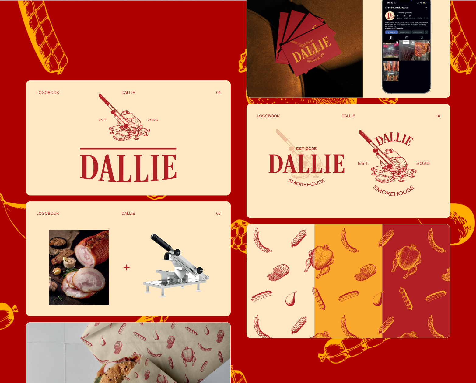
Dallie Smokehouse provides a relevant example for product businesses. Its identity accompanies a Shopify store and product presentation for smoked delicacies. Lokalizacja offers a different context, where the agency identity sits beside property photography and listing information. The setting changes the questions the logo has to answer.
A refresh needs a reason to change
If an existing mark is already associated with your business, begin by identifying its strengths and difficulties. It may be hard to read at a small size, awkward in digital layouts or inconsistent across available files. Those are specific problems to discuss.
Some projects need refinement and a more usable set of versions. Others need a different direction because the business name, audience or offer has changed. The decision should account for where the old mark is already used and which materials would need updating.
Bring the current files and several examples of real use. They help distinguish a design problem from a file or application problem. That can make the scope more precise and avoid replacing a recognisable element simply because one version is inconvenient.
Keep logo design and the wider identity connected
A logo package addresses the central mark and its agreed basic uses. It does not automatically define every colour, text style, image treatment and document layout the business will need. Those surrounding choices can substantially affect how coherent the brand feels.
Our visual identity package includes the logo and develops that wider system. Our full brandbook package includes logo, identity, rules and examples. If you are preparing a store, packaging and sales materials together, considering those relationships early can make the overall scope clearer.
You can also begin with a focused logo project when that matches the immediate requirement. The important point is to identify which assets the business needs now and which belong to a later phase. The proposal should make the distinction visible in the deliverables.
Receive files that match the job
A logo should arrive in formats suited to the agreed uses. Scalable artwork serves different needs from a ready-to-use image for a document or profile. Versions for light, dark or single-colour applications should be named clearly when they are included.
Basic guidance can explain which file to choose, how much space to preserve and which changes would damage the mark. Your team should not need to guess whether to stretch, recolour or crop it to fit a layout. The handover should make routine use understandable.
Any typefaces or other assets involved also need their intended uses and licensing responsibilities identified. If a manufacturer or printer has particular specifications, provide those before production files are finalised. A design presentation and a file prepared for a specific production method are different stages of work.
Make feedback specific enough to act on
Useful feedback refers to the business, the reader or the application. The name feels too formal for the offer. A letter is difficult to recognise. The compact version loses the distinguishing detail. Those observations give the discussion a clear direction.
References can help communicate a preference, but explain the quality you are responding to. It may be simplicity, a sense of craft or a particular balance between name and symbol. The purpose is to understand the desired character, not reproduce another business's mark.
Tell us what the company does, who should recognise it and where the logo needs to appear. Include existing files and any wider identity plans. We can then discuss the appropriate scope, the applications used for review and the usable versions the business should receive at the end.