
Make different materials feel like one business
A website, proposal and product label do not need the same layout. They do need a recognisable relationship. When colours, type, imagery and graphic elements change without a shared direction, customers may have to work harder to connect the material with the business they know.
Visual identity provides that direction. Our package includes the logo alongside colour, typography, graphic language and agreed applications. It gives the business a system that can adapt to different formats while retaining its character.
Pills develops visual identities around the offer, audience and material the business needs to produce. The starting point may be a new company, a new product or an established business whose presentation has become inconsistent. In each case, the work needs a practical set of applications to test and deliver.
The logo belongs inside the package
Our visual identity package includes logo design. The mark is considered together with the visual elements around it, so the result can work as a coherent whole. You do not need to commission the logo separately before discussing the identity.
If you already have a logo you want to retain, bring the source files and examples of use. We can discuss what can be preserved and which parts of the wider system need development. That should be an explicit scope decision rather than an assumption that every project begins from zero.
The relationship between mark and system matters in daily use. A quiet wordmark can work with expressive photography. A distinctive symbol may need a restrained surrounding layout. The right balance comes from the business and the contexts where people encounter it.
Give colour and typography clear roles
A palette is more useful when its colours have purposes. One may establish the main brand presence, another may support backgrounds and another may draw attention to a specific action. The identity should help users understand how those choices relate, rather than hand over a collection of attractive swatches.
Typography also needs roles. Headlines, body text, captions and practical information should remain related while doing different jobs. The type needs to suit the languages the business uses and remain readable in the formats that matter.
These decisions are tested in application. A combination that feels strong in a short headline may be uncomfortable in a long proposal. A colour that works on a screen may need a production discussion for print. Naming the intended uses helps identify those questions before delivery.
Build a graphic language beyond the mark
Graphic elements can help a brand remain recognisable when the logo is small or absent. Depending on the direction, that may involve shapes, patterns, illustration, image treatment or a distinctive way of arranging information. The choice should support the business rather than add decoration everywhere.
The elements need a clear relationship with content. Product imagery should still communicate the product. A service document should still be easy to read. A visual device that overwhelms the message can become difficult for the team to apply consistently.
We can discuss the appropriate level of variety and the assets needed to support it. Some businesses benefit from a restrained system with a few reusable elements. Others need more expressive material. The scope should describe the actual graphic work and the applications used to evaluate it.
Choose applications that represent everyday work
A useful identity project includes a defined set of materials. These might be a website direction, a presentation cover, social templates, business stationery or a product application. The list should follow what you plan to use, rather than a standard assortment of mockups.
For each item, clarify whether the deliverable is a visual example, a reusable template or a finished production file. Those are different levels of work. A proposal can show how a presentation should look without automatically including a complete editable sales deck.
Share existing examples and production requirements early. They reveal real constraints such as long titles, multiple products, bilingual text or supplier dimensions. Testing with realistic content makes the identity more useful than relying on perfectly short sample wording.
See how identity meets a website
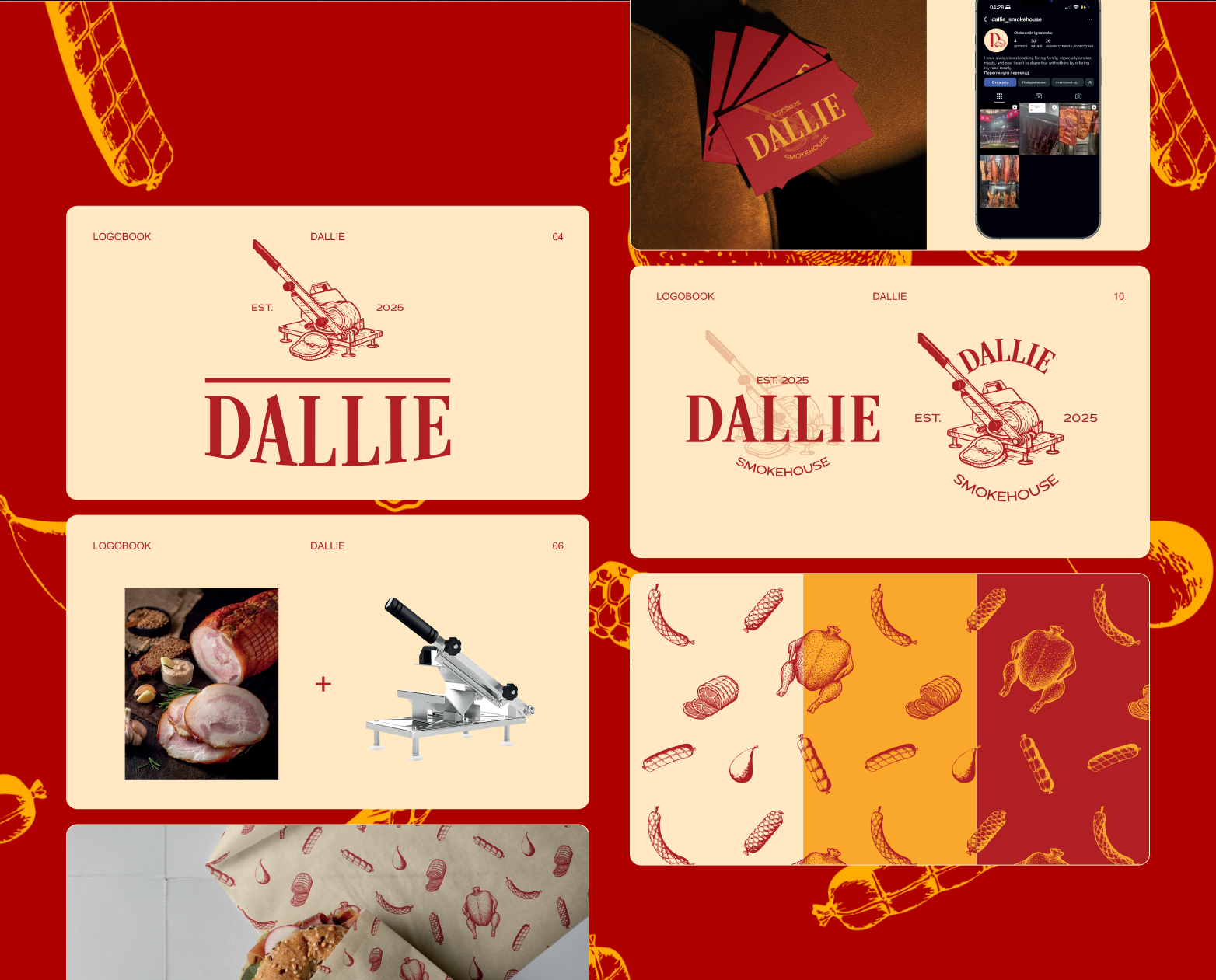
Dallie Smokehouse combines a logo, visual identity and brand rules with a Shopify store. For that US food business, the identity belongs to the product presentation and to the storefront where retail buyers shop and wholesale prospects make contact.
Lokalizacja brings branding into a real-estate agency website. The visual system sits beside changing property images, prices and parameters. It needs to make the agency recognisable while allowing individual offers to remain clear and comparable.
These projects show different relationships between identity and content. For your business, we can consider the website or store alongside the brand work. That helps establish whether imagery, typography and graphic direction support the customer's decision across the complete presentation.
Plan how the team will use the system
Identify who creates material after launch. A founder editing social posts, a salesperson preparing proposals and an external designer producing a campaign need different levels of guidance and different files. The handover should reflect those roles.
Our visual identity scope includes the agreed assets and applications. If you need a fuller reference for multiple users and suppliers, the complete brandbook package adds the documented rules and examples around the identity. We can also discuss documentation separately when an established system is already in place.
File organisation matters. It should be possible to find the right logo, colour reference or template without comparing several uncertain versions. Agree the editable materials, exported formats and any licensing responsibilities so the team understands what it has and how it may be used.
Begin with the materials you need next
Tell us what the business does, who it serves and what is changing. Share the existing logo, website and a few everyday materials, including the ones that do not currently feel coherent. Explain what you need to produce for the next launch or stage of the company.
A useful brief also names the intended languages and the people who will use the identity. If packaging, print or a new website has specific requirements, bring those into the discussion. They can influence the direction and the practical deliverables.
We can then define a visual identity scope that includes the logo and the surrounding system at the right depth. The result should help the business make different materials with a recognisable character, clear roles for each element and a usable foundation for the work that comes next.